College Program Finding
Overview
Shoreline Community College, with 100+ degree and certificate choices, faced a critical problem: students struggling to navigate program-related information on their website and often encountering outdated information. This adversely affected enrollment and added stress for front-line staff.
Goal: Revamp Shoreline's program navigation experience to provide an effortless journey for prospective students, while implementing sustainable content management best practices to reduce workload and errors.
Challenge & Goal
My roles: Product Manager, Lead Researcher, Information Architect, Content Strategist
Roles
Additional team members: UI Designer, Front-end developer, IA Consultant
Increased average time on site by 25%
Increased visits to program detail pages by 60%
Reduced new program page build turnaround time by 65%
Results
As part of our work together, Adam demonstrated considerable knowledge of UX best practices and innovation, user research, project management, and design thinking. He also kept a keen eye on how the high level concepts we were developing could be applied to the other specific challenges that faced his department day-to-day.
Andy Fitzgerald, PhD, Information Architecture & Content Strategy Consultant
Process
A major initial challenge was stakeholder misalignment on terms and concepts (e.g., how do we define a “program”). This surfaced a serious issue with inconsistent labeling and categorization that extended beyond the website, affecting all student materials and systems. More importantly, it created challenges to getting started on the work. To resolve this, I sought executive buy-in to broaden the project scope to include taxonomy work.
How I got buy-in
Presented at several executive leadership meetings where I facilitated various activities that raised awareness and understanding of taxonomy issues.
Brought a well-respected taxonomy consultant to co-present at one of our meetings, adding some external objectivity and validity to this challenge.
Leadership Buy-in
I developed a comprehensive research plan to understand how prospective students learn about and choose programs, and what information guides their decisions.
Research
100+ Participants
including current students, prospective students, faculty, and staff
8 Research Activities
including heuristic analysis, data analysis, user interviews, open card sort, observation study,
n-gram keyword analysis
Key findings
50% of students started exploring with a general sense of subject matter interests (e.g. art, engineering, healthcare), 30% started with an educational outcome in mind (e.g. transfer to 4-year school, develop a vocational skill), and 20% prioritized formats (e.g. online degrees)
During an open card sort, 100+ students had grouped degrees and certificates into 4-6 topical ambiguous categories such as business, arts, science, and health.
All participants found it difficult to find and compare programs due to lack of consistent navigation patterns, page layouts, and labeling
Too many points of contact for each program made it unclear who can help answer questions
Priority information needs included: costs, length of program, and required courses
Calls-to-action were not present on pages where students were likely to take action
Search produced links to outdated PDF files
Content Design & Information Architecture
I audited over 2000 content items to surface all of the content related to program navigation. Using the research and content audit, I was able to come up with a proposed taxonomy and information architecture. I determined that a blend of faceted and hierarchical taxonomies would be needed to accommodate the student's exploration preferences.
Content Blocks, Wireframing, Prototyping & Testing
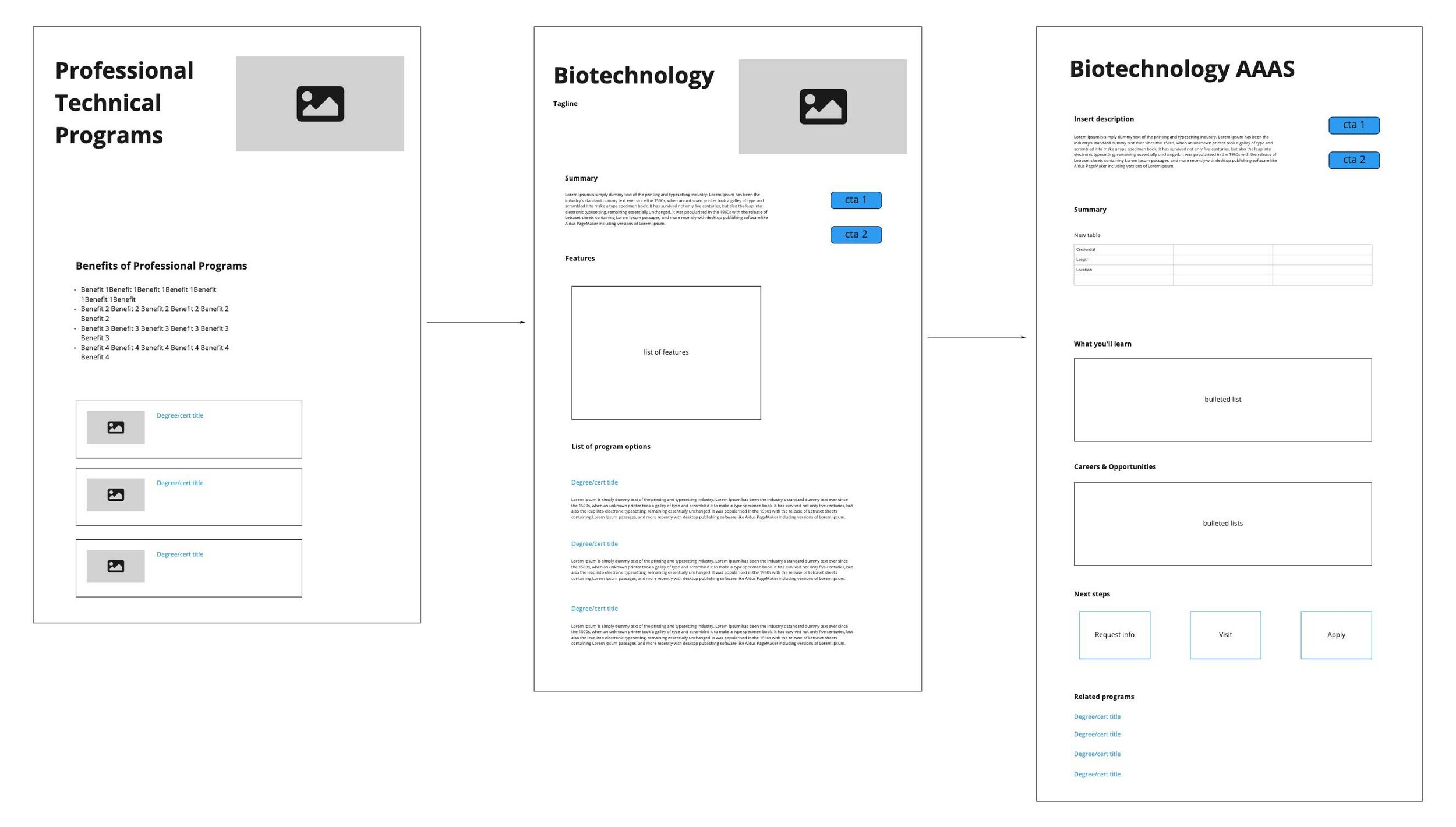
Content blocks were created to represent the key content components of each page. From there, I created wireframes in Axure so that I could accurately test the flow with users.
Featured Deliverables & Outcomes
A scalable faceted search page was created, leveraging a dynamic categorization system over traditional hierarchical structures. We classified programs into Areas of Study, Format, and Program Type, effectively reducing user cognitive load by making it easy to narrow down their search in one place.
Faceted Program Finder
The existing program-related landing pages were all redesigned with an intuitive visual hierarchy, featured images, and clear CTAs. These pages allowed us to provide a hierarchical navigation experience, while also gaining SEO value for common keyword searches such as ‘transfer’ and ‘online degrees’.
Redesigned Landing Pages
Structured and Centralized Reusable Content
Structured content allowed us to store all the content blocks and important taxonomy information in a database for future reuse and more manageable changes to the site as we grow and enhance the program navigation experience.


